大橋史《新しい風》
Artist Interview
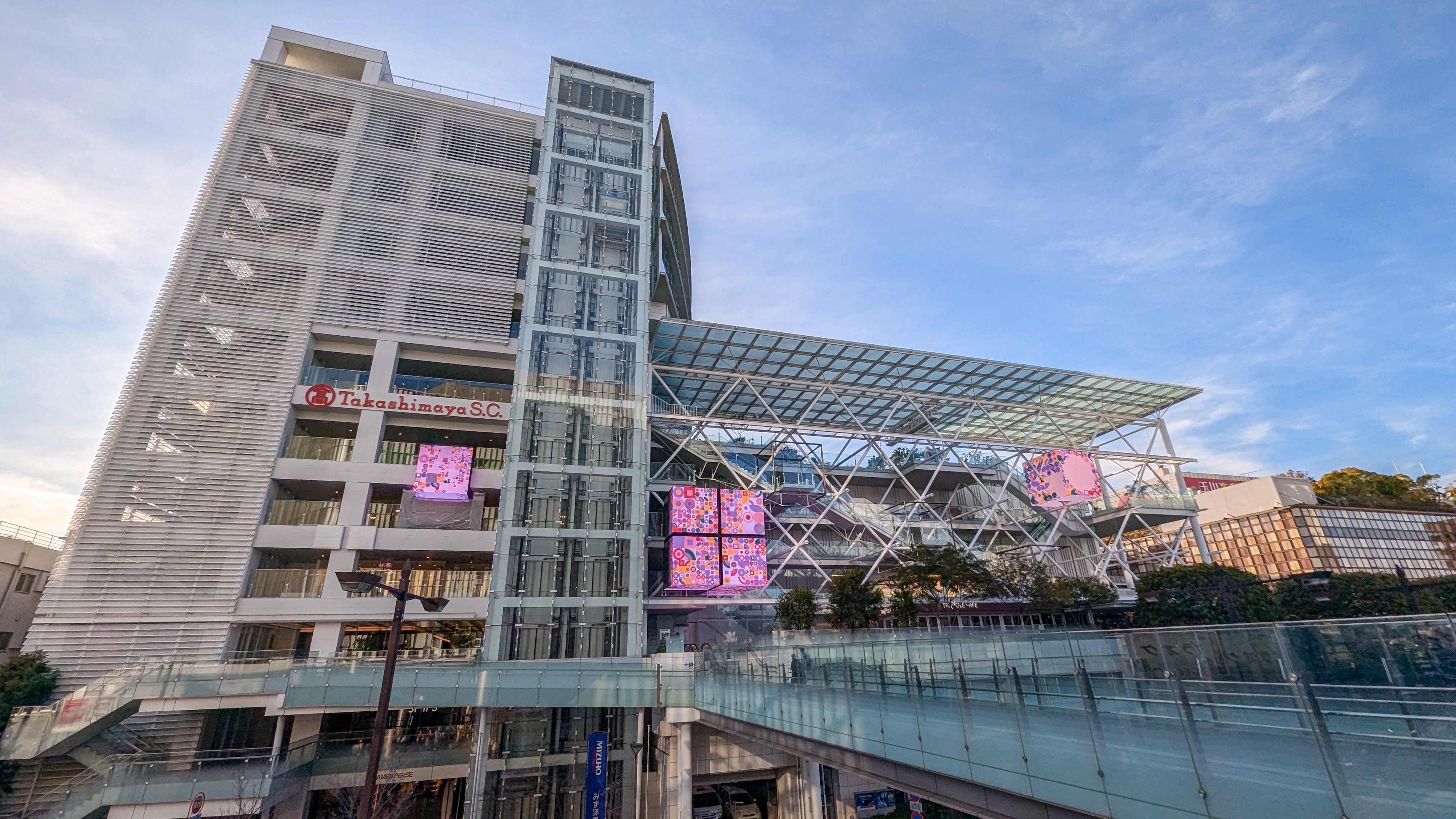
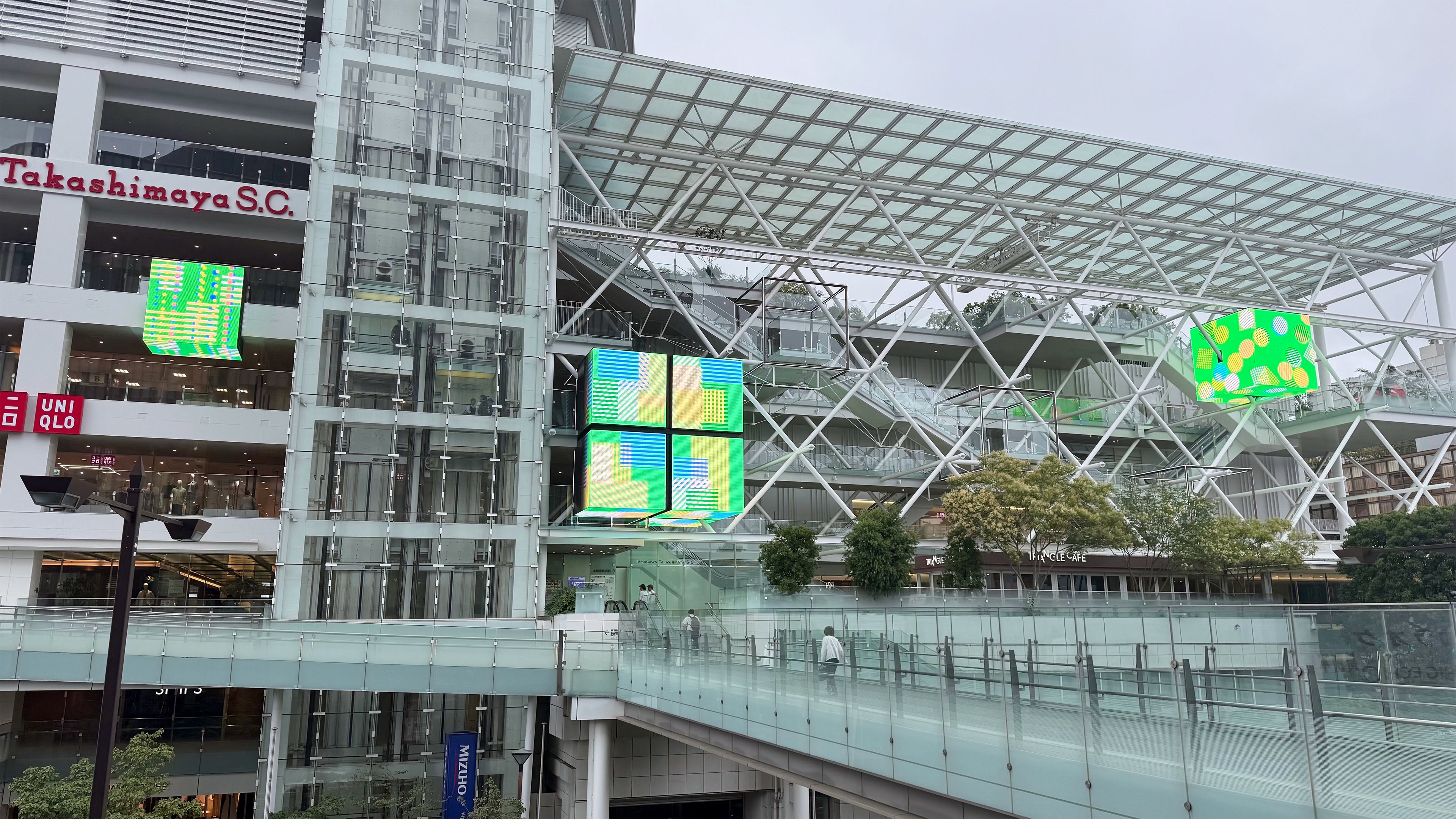
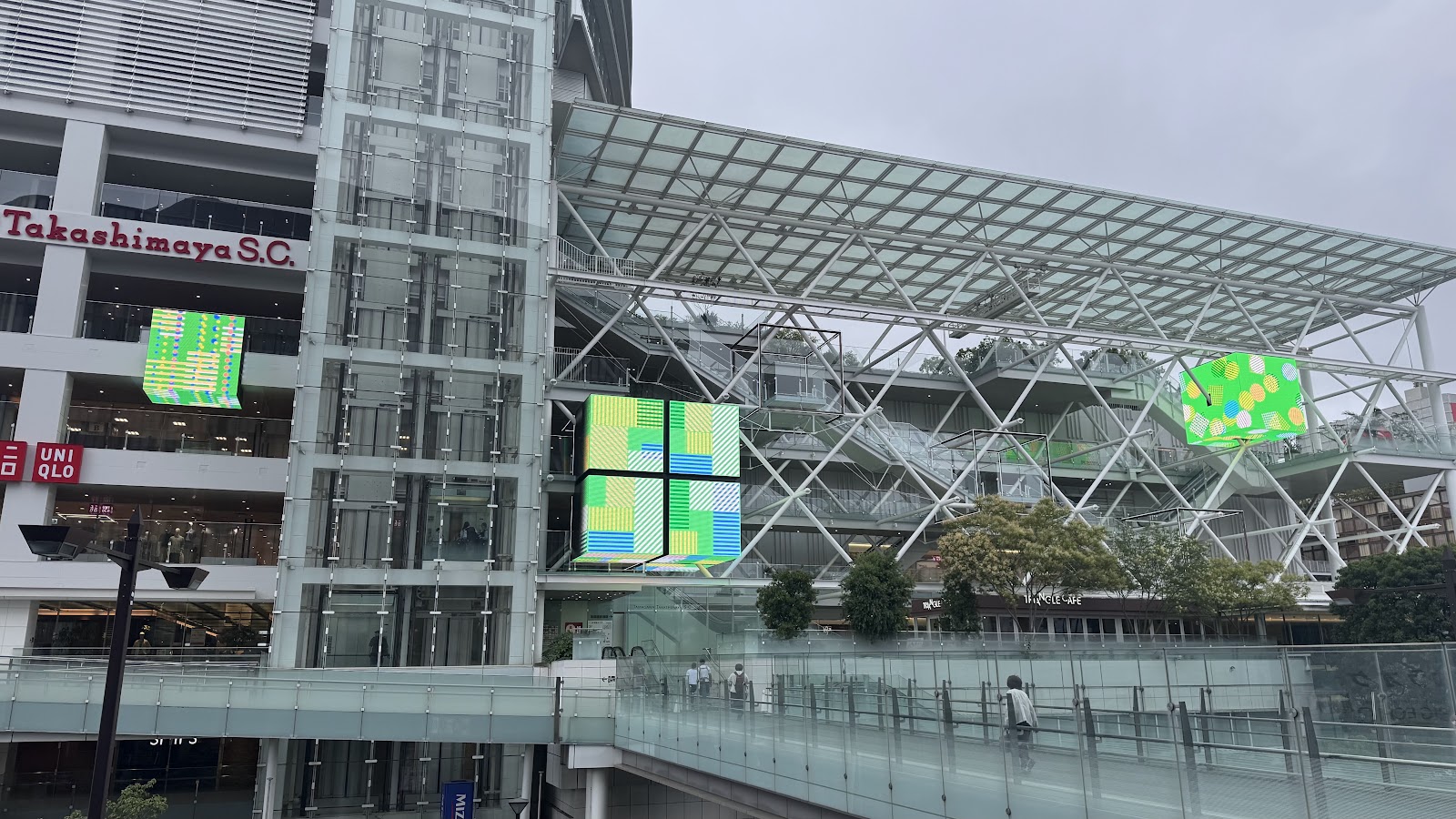
July 24, 2026, Futako-Tamagawa, Tokyo. In front of the LED cube installed on the facade of Tamagawa Takashimaya S.C.'s South Building, we spoke with motion designer Takashi Ohashi. New Wind (July 1–September 15, 2026), currently on view, is a video work made for this large display placed in the middle of the city. The LED cubes are three large displays installed as part of the building's exterior renewal in March 2025, showing video on screens of up to six meters square under the concept of "a cube that resonates with the city." Unlike a social media timeline, which viewers access on their own, this is a medium that enters the field of vision of an unspecified public, amid the sound of trains and the wind moving through the streets. In that place, Ohashi put a video built on moiré. Why moiré? The railings and fences he sees around the city, memories of time spent with his family on the Tama River, and the influence of Bridget Riley and Josef Albers. When Ohashi, who has worked as a motion designer for nearly fifteen years, placed his work somewhere other than the social media timeline, what did he see there? Amid the people passing by, the sound of trains, and the wind slipping between buildings, we asked him to walk us through the background, step by step.
Depicting What the Eye Cannot See
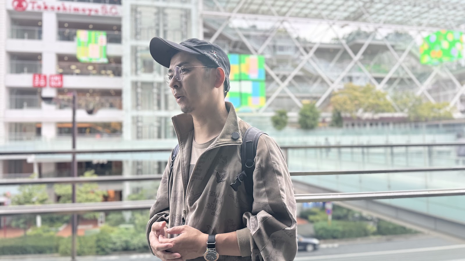
His work centers on advertising and music videos, and recently he has also come to work on openings and endings for TV anime, and even on the episodes themselves. It has been nearly fifteen years since he began working as a motion designer.
"Client requests, budgets, schedules — within all those conditions, how do I make something only I can make? That's something I wrestle with every day. But the number of people who know my work has really been growing little by little, and this signage job for Takashimaya was one where I got to work surrounded by people who understood my creativity. It was a genuinely happy time."
While asking about his everyday work, we also asked how Ohashi thinks about the essence of motion design. What is generally known is motion with practical purposes — smartphone UI, movements that guide the eye through web services, animation used in advertising. Ohashi, for his part, locates its essence within a broader history of expression.
"The common jobs are making smartphone UI, eye-guiding motion for web services, the animation used inside ads. But for me, the essence of motion design lies in depicting what the eye cannot see — like the Expressionism that began in the early twentieth century, and the abstract animation made under its influence."
Then what is "movement," the thing at the core of that expression, for Ohashi?
"Movement, music, space, emotion — roughly speaking, the concept of time. I think expression that gives shape to time is the essence of motion graphics."
The Social Media Timeline, and a Place Where the Wind Blows
"You make something, and the result gets shown inside the tiny window of a social media timeline. And honestly, I think we work inside this fear and impatience that someone might go 'okay, next' and swipe it away in a second. In that sense, I'm always working in a rush — to be honest, it's become a really painful kind of work."
This probably applies not only to himself but to most people in their twenties and early thirties making animation and motion graphics today, Ohashi continued.
"But public art like this — the noise of these trains, the wind blowing through the buildings — nature, the city, the weather. Knowing my work might be seen inside such a public space, it felt like a very healthy job."
Choosing Moiré
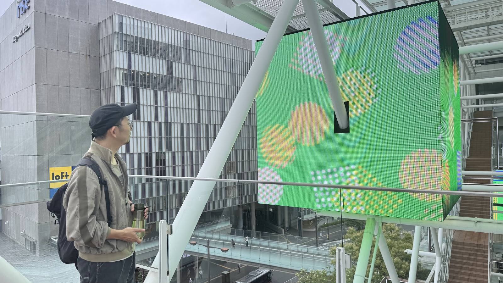
He thought about the work's expression starting from the place itself, Futako-Tamagawa. How could the landscape of this town, where the river, green space, and the city sit side by side, be turned into video? What Ohashi chose was moiré.
"Futako-Tamagawa itself has a really striking structure as a town — river, green space, city. If I was going to make a work drawing on hints like the way leaves overlap on the trees, or sunlight filtering through them, I thought moiré would be the best subject."
At the stage of first talking with NIINOMI, he expected it to become a somewhat more organic animation. But how do you let the different elements of city and nature coexist on a single screen? As he searched for a way, his interest turned toward optical art and modern art.
"If I was going to reconcile an urban, refined visual with images of nature — light, sun through the leaves, the flow of the river — I thought it would suit this project better to reference optical art and modern art like Bridget Riley and Josef Albers, with a very slow flow of time, an expression where your eye is following a phenomenon. That idea came to me pretty quickly, actually."
Choosing moiré also created challenges in production. He needed to build delicate changes into the image while avoiding the Harding-test issues caused by the interference of fine lines. The movement itself is based on keyframe interpolation, with slight modulations of pace added on top.
"If it gets too linear — I wanted to give the moiré's expression some subtle changes, so I do add a certain modulation. I want to bring a musical image into my work, a sense of listening to music. Rhythm, and also swinging between tension and reassurance: there's a beginning, and where does it land, and the comfort, the relief of the moment it lands. When you express that through movement, I think you should control the nuance of the easing between keyframes at least to some degree."
"Why Are Your Animations So Energetic?"
What Ohashi aimed for here, though, was not to dramatize the movement. Rather, by holding the movement back, he was thinking about evoking natural phenomena themselves.
"This is a bit of a trauma from my student days — I had always made energetic motion graphics. I was in the Department of Information Design at Tama Art University, and there was only one professor in charge, so I wanted other teachers to see my work too and went over to the art studies department. And the professor there jabbed at me: 'Why are your animations so energetic?' And I thought — he's right!"
That remark led him to re-examine the very movement he was making.
"Maybe I was anthropomorphizing the colors and shapes in front of me too much. I'd internalized too much of that human-centered pleasantness — if it moves this way, like a person would, it's charming — that kind of loveliness, that anthropomorphism."
In this work he held back that human "energy" and excessive staging as much as possible, aiming for movement that evokes phenomena like overlapping leaves, waves, and the flicker of light.
"I think I absolutely could have made it move in a cooler way if I'd wanted to. But then, to evoke leaves overlapping on the trees, or waves, or the shimmer of light, it might have come off a bit contrived. The intent was to keep any excessive staging of movement truly to a minimum."
A Translucent Wall, and Memories of the Tama River
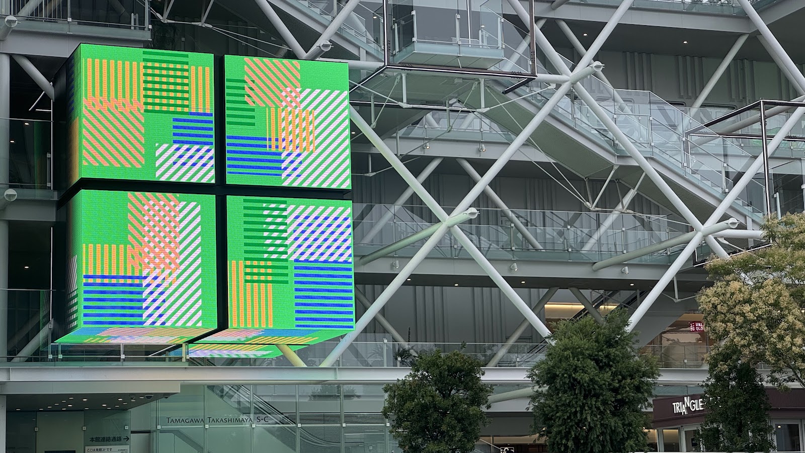
The interest in moiré that grew out of this connects, in turn, to the railings and fences Ohashi sees every day around the city.
"Like the lattice-like pattern on those buildings at Futako-Tamagawa Station right in front of us. I usually work from home, and when I go out shopping or to pick up my kid, the railings and fences all over town started catching my attention more and more."
As one reason he is drawn to fences, Ohashi points to a state where something that blocks and something that flows coexist.
"For example, this glass wall is transparent, but the glass is right here, blocking the flow of this space, isn't it? Visually the space looks like it opens up, but the air actually isn't flowing through here. But if this were a fence instead, there would be a translucent wall, and yet you would feel the flow through it. There's a wall, and yet it can let the flow of air pass — that double nature, that ambiguity, is something I'm really interested in."
Sightlines and wind passing through the gaps in railings and fences, and the moiré their repeating structures create. That sensation became an important starting point for this work.
"There really are moments when you feel the moiré of a fence itself, aren't there? The moiré of the fences and railings you see walking around town — I loved Bridget Riley to begin with, so that became an inspiration."
At the same time, the work had another starting point in a more personal memory. The first place Ohashi lived after leaving his parents' home was near Komazawa-Daigaku Station, a few stops from Futako-Tamagawa.
"The first town I lived in after leaving home was Komazawa-Daigaku Station — really, just a few stops from here. Back then I moved in with my girlfriend, we got married, we went on dates, later we had a child and played by the Tama River. Memories of time spent with my family were at the base of it. So from the very first stage, the intent was there: take the flow of the river, the sway of the waves, natural phenomena as the theme, but let it finally land as an urban visual."
Pointing at the work on the screen in front of us, Ohashi continued.
"The work right in front of us, too, moves from the image of the river surrounded by the Tama River's green spaces into an expression where objects stream past in straight lines. At its root is the memory of playing in the Tama River, the three of us — my wife, my daughter, and me — so there may be a slightly ulterior wish in there, wanting to be liked by children. The cute feel — a bit like ohajiki, those little glass playing pieces."
The moiré inspired by the city's railings and fences, and the scenes by the Tama River. The two different images overlapped and were converted into abstract graphics.
"I wanted to do something like Bridget Riley's dizzying stripes, but there's the Harding-test problem too. When I actually trimmed the various materials for making the moiré — trimmed them into circles and squares and looked at them — I'd like to think I managed to express, through fairly abstract graphics and movement, things like the creatures living in the river that the eye can't quite see, and the happy memories of time spent with my family."
Like Playing in the Sand
In this production, the expression of moiré itself became a fresh experience of making for Ohashi.
"Usually when I make motion graphics, I have a fairly clear vision of the finished piece in my head from the start, and I brush it up over and over until it finally comes close to that image — it's work where I keep issuing retakes on my own work. But with moiré this time, once I tried it, the unexpected expressions of color and line were just so much fun. It felt like the sand play I did as a kid — like playing with sand, or clay, or paints. At a glance it's very digital, but I got to feel like I was playing with rather analog materials."
Unlike his usual production, where he assumes a finished form in advance and raises precision toward it, in making the moiré he could enjoy the chance-born changes of color and line themselves. Asked about that sensation, Ohashi says there was something like a handmade quality to it.
"Maybe I'd been driven, somewhere, by an obsessive feeling that I had to put more of the maker's design into it, make it more elaborate. There was a surprise in finding that, without going that far, color and shape alone could produce this many expressions."
Video That Became a Solid Object
In this work, the video is not shown on the front faces alone. There is a display on the underside of the cube as well, and a single video unfolds across multiple surfaces. That structure made Ohashi conscious of the video not as something inside a screen, but as a three-dimensional object.
"If it were only the side faces, I don't think it would affect things that much. But with an underside in addition to the sides, I couldn't help becoming conscious that the video I was making was a solid object. Though while I was making it, that part was pretty hard to imagine."
When the work actually began running on site, phenomena he had not anticipated occurred.
"The work in front of us right now is a video where objects flow from right to left, and the moment the wind moved through, the digital expression and the sideways movement you feel physically synced up — that catharsis. There was a surprise there: so this can happen."
The video begins to form unexpected relationships with its surroundings as well. It reflects on the glass of the elevator and layers with the plants nearby. The colors Ohashi chose, too, came to resonate with the architecture and the streetscape.
"It reflects on that elevator over there. It reflects, and gets layered nicely with the plants there. And when you look around — the motif color I'm working with is green, and I knew in advance that Takashimaya itself has a lot of these green motifs, so the sense of the real things and the video linking up, color to color, was a really happy discovery."
| Artist | 大橋史|Takashi Ohashi |
| Space | 玉川高島屋S.C. LEDキューブ |
| Period | 2026.6.30 15:0:0 -2026.9.15 4:0:0 |